Bringing backgrounds to the foreground: #GameDev diary


By far the best part of developing our point-and-click adventure game, The Protagonish, was working with professional artists. I've already mentioned the huge learning curve for me, understanding layouts, art styles, brushes, and colour palettes, and a whole technical language I didn't know!
But today, we're going to share the stages through which we developed the background art, with the amazing Lucy Gillespie! We bonded over a mutual love of clouds in Studio Ghibli movies, as I wanted clouds to be a big part of the visual language of The Protagonish. But I'd never done any art development before, so Lucy brought a tonne of patience and professional experience from working on short films and TV series in the 2D animation industry. This was essential to correctly choose things like the desired final resolution and aspect ratio for digital assets, and the layers and formats that we could bring into our game engine.
One of the first steps was getting art references: basically geeking out over our favourite games, TV shows and movies, and choosing which styles we loved, which would fit with the game, and which were achievable in the time frame. One very early misconception I had was that artists only work in one style: with amazing professionals like Lucy and Elena, we could have any art style we wanted, from cartoony to realistic, so references and our final style could be inspired by anything.
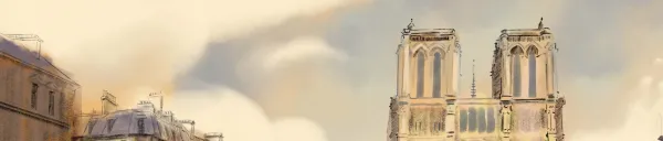
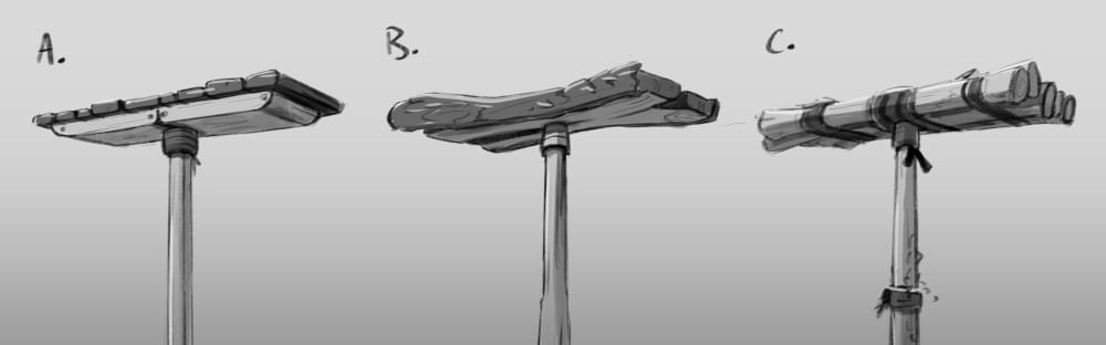
The next step was layout sketches for the 4 scenes, based at that stage on only brief descriptions I had of each scene, and what would happen in each. While Lucy did some brief notebook sketches, almost all were drawn straight to digital with tablet and stylus. The monk-on-a-pole seemed the easiest, so this went straight to striking black and white layout options:
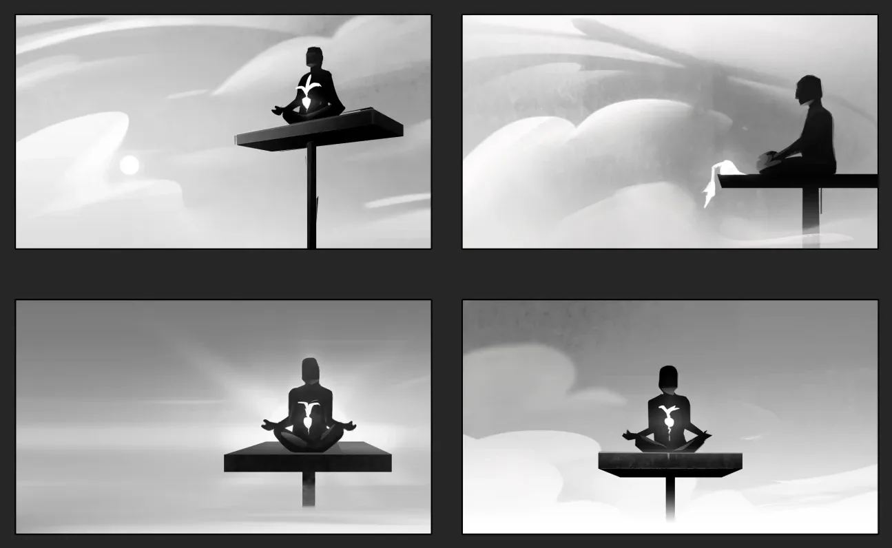
Spot the magic radish! From this we could choose the layout and perspective we liked most: making sure that it would be an angle that worked for the flow of the dialogue (even though the other character, The Adventurer is offscreen) and that we didn't need to redraw the main character to face the monk. We also had to make it clear to the player that the pole was too high for the Adventurer to climb (we took out early thick vines because it looked like they were climbable), but that the magic radish was somewhere where it could conceivably be stolen by the grappling hook! It's so important to make sure that each scene is going to work for the puzzles, story, and complexity of other aspects like character animation.
This was also the first scene where we experimented with colour palettes:
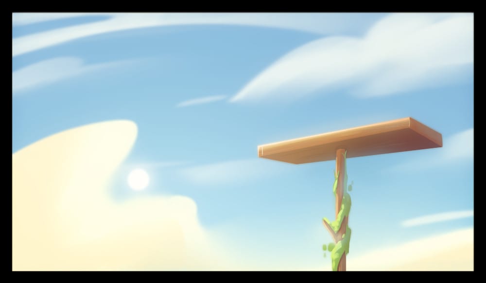
But we also chose at this stage the brush and line style, eventually going for a cartoony-painterly look, and also choosing the visual style through things like how curved elements were, as well as how broken or industrial our world would be. Choosing the more 'handmade' and rounded style in C, made for a more cozy world, all the more jarring for the Adventurer to threaten, and so nudging the player to work against him:
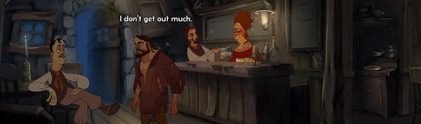
Other scenes were more complicated, so the shop went through many layout sketches:
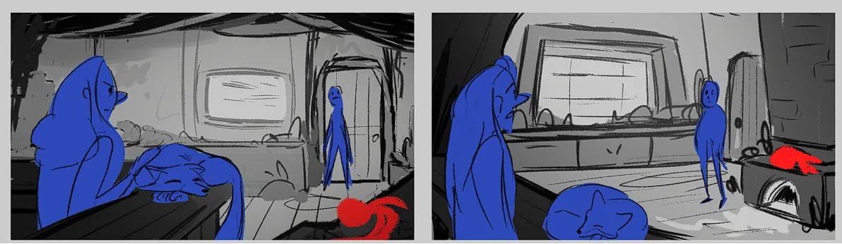
Here characters are highlighted in blue, and interactive props in red, to make sure we can frame them in the scene. We were always trying to keep the same oblique angle to the camera in these scenes, so that we only have to draw the adventurer from the same angle for every location, saving a lot of time and money in animation! Note things that we loved but were changed in the final scene, like the beams and shadowed foreground items to create framing and depth, and how we changed the framing of the door to make it more prominent in the scene, and so more of a big deal that it gets destroyed. This was given a full sketch, showing the line style and level of detail:
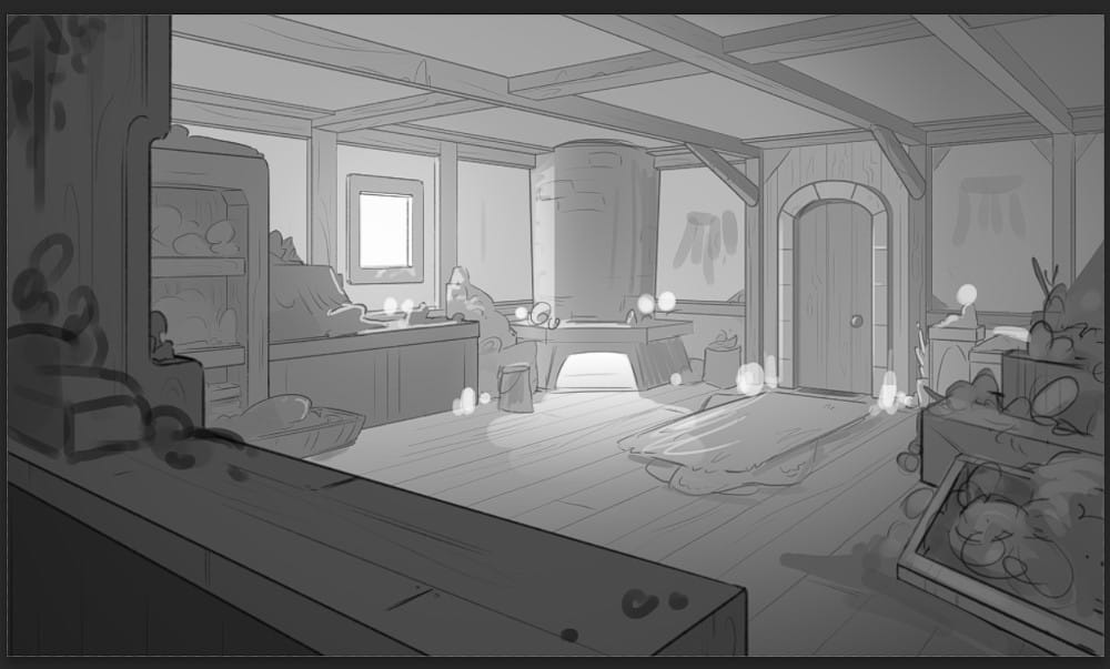
Drawing attention to the important parts of the scene also comes through in the final light and paint, with darker areas sending lines to the door, and bright areas for the main characters:
We went through many iterations of the colours and saturation in this scene, trying to make it noticeably 'inside' and so a bit darker that the outdoor scenes, but also not too gloomy, but cozy, again setting a peaceful mood that The Adventurer is destroying.
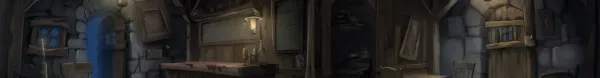
Each of the scenes is built from many layers with transparency, so that objects and characters that move can be behind or in front of different elements. The door also has several layers we can toggle the visibility for, so that it can be closed or 'broken':
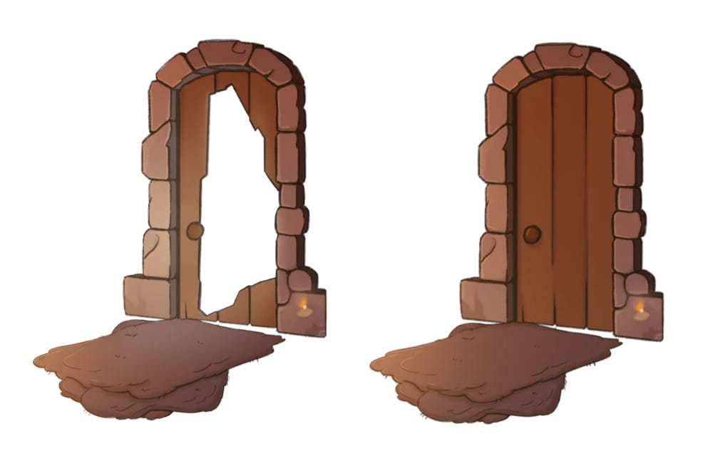
Note that the layer for the door also includes the paving in front of it and the stone around it, so that it can be bright and lit with the open door, and darker in the 'shut' state.
For our next game "Claude", we've also story-boarded all our scenes, but we didn't have the budget to do this in The Protagonish, and the action in the scenes was much simpler. We'll go through what's involved in story-boarding a point-and-click adventure game in a later blog post!
So it's an incredible amount of work to do this quality of art work, about a month for just 4 scenes, but that also includes the art-dev time and experimenting with style. Cost of the art approach is always a major consideration, and for 'Claude' we are going to have 10 times as many scenes. So this has led us to develop an art style where Lucy can draw and paint one layout on average every week!
I hope this helps show the processes and considerations needed for 2D background creation in gamedev (and also a lot of traditional animation as well). I think it's also worth noting how much more you get from professional artists compared to DIY or GenAI approaches - there are so many things to consider in each stage of the development, and a great part of it is the experience Lucy has from previous projects and also the discussion over all these elements that allow everyone to be creative. Not only is the final product higher quality, but as everyone knows the story and aims of each scene (something you can't really explain to GenAI), it just works better to communicate and dazzle. The art is always the first thing that wowed people at tradeshows, and is praised in nearly all our reviews, so it's so important to help us stand out, and make for a beautiful experience you want to explore!
Next time, we will look at all the processes required for character development and animations in 2D gamedev!
The Protagonish is currently 50% off on Steam and itch.io!!!